Checkout Redesign
Building a data driven process
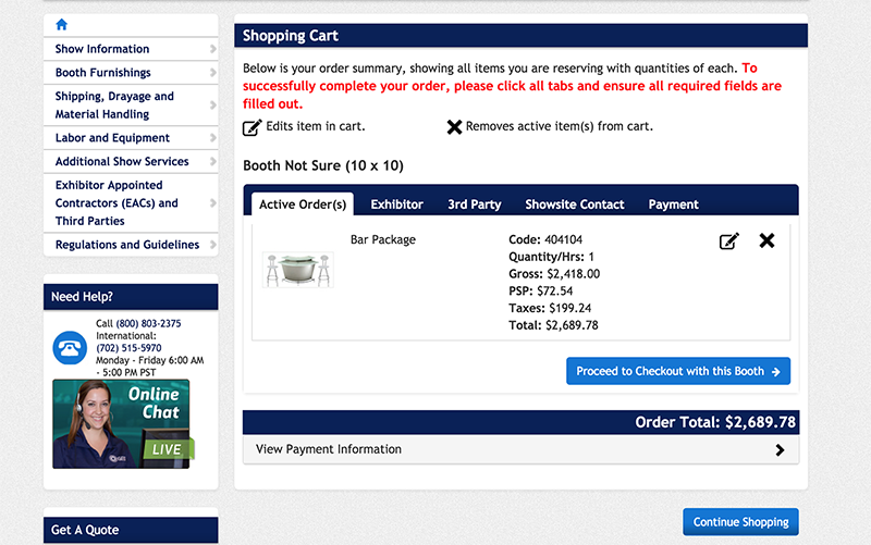
Checkout design before
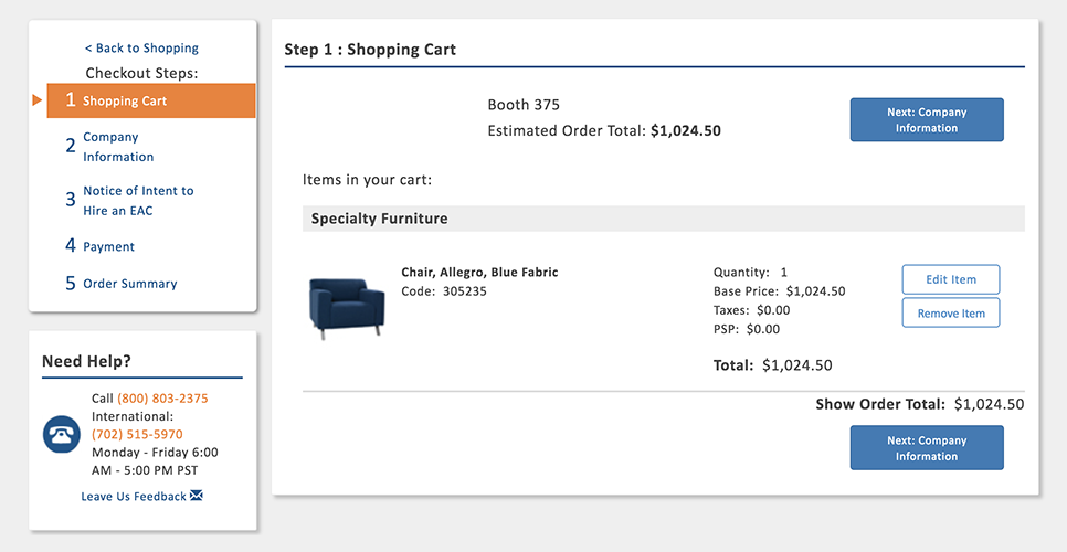
Checkout Design after
Summary
By targeting one of the largest drivers of customer complaints to our call center and integrating user testing into our design process, I was able to increase the rate of checkout completion by 9% and increase self-reported customer satisfaction by 10%. In order to achieve this, I created a process for conducting remote user tests with actual users, implemented analytics goals to measure completion rate before and after, and projected the revenue impact of the project in order to justify the investment.
Checkout Completion
9%
Customer Satisfaction
10%
Checkout completion percentage increase after redesign
Defining the Opportunity
One of the first things I did when assigned to work on this product was to conduct a listening tour of sorts to help me understand how this business operated, who its customers were, and what problems existed. My goal was to get as broad an understanding as possible of the context in which this product was being used, and to understand how changes in one area could have impacts both felt throughout the business and through the customer's business.
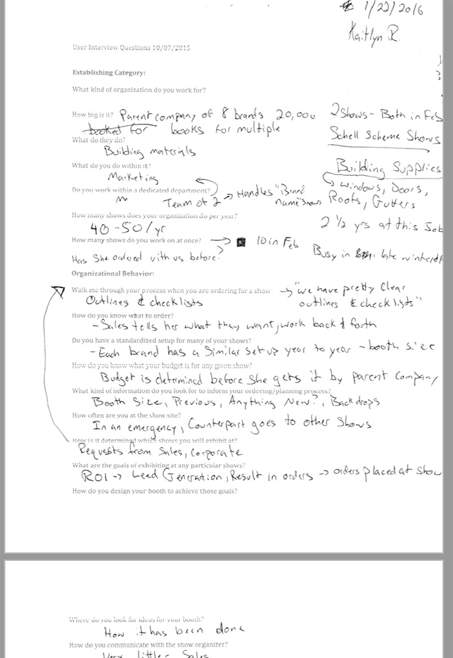
In addition to stakeholder meetings with management in both the IT department and the call center, I observed and spoke with call center representatives and customers in order to get as many perspectives as possible. I listened in on service calls and observed chats, interviewed customers who had ordered with us recently, and observed support personnel at show site. The output of this effort was a list of pain points to be addressed in order to improve the customer experience, reduce service calls, and drive revenue.
Interview script with notes
GA Goals set to measure checkout completion
Benchmarking
In order to define success for the project, we needed to know where we were starting from. Google Analytics was installed on the site, but there were no goals set up in order to track the completion rate of the checkout. I created goals based on reaching the checkout page and the order confirmation page to assess its current state and provide something to measure against.
In addition to revenue to the business, it was also important that we improved the customer experience. To measure this, I created a survey that would be sent out to customers twice a week in order to quantify their experience with certain key features.
The existing checkout had a completion rate of 60%, and a 24% rate of answers at or below 3 out of five. When cross referenced with previous years revenue, we determined that every percent increase in the checkout completion rate roughly translated to an increase in revenue of $1.5M
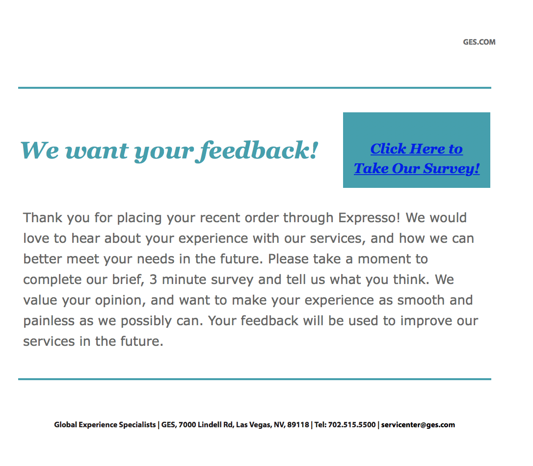
Survey Recruitment email
Survey Results showed that about a quarter of our customers rated the checkout experience as unacceptable.
Gathering Requirements
Being a global business that operates within a unique industry, there were a number of requirements that are very different from a traditional ecommerce system. I spoke with stakeholders in the US, the UK, and Canada to understand the unique requirements in each region.
The US had by far the most requirements due to various functions of the business. It needed to be able to place a credit card on file in addition to accepting payment, name an additional contact for show site, collect an NOI, and support third party ordering. In EMEA, the checkout needed to be able to calculate a VAT tax.
Best Practice Research
In order to make the best product possible, I conducted some research into ecommerce checkout best practices. What other things existed that would help me solve problems for our users?
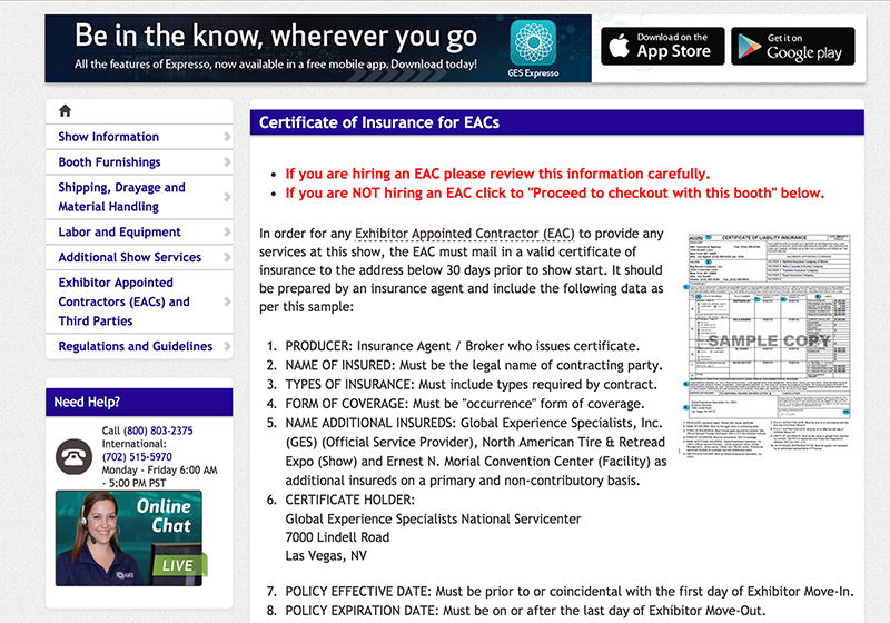
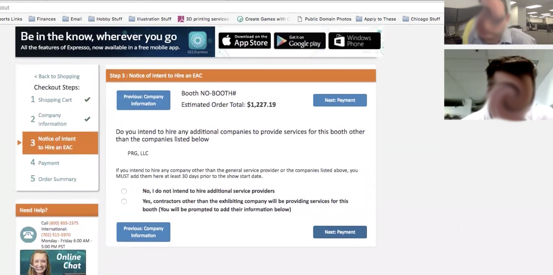
On the previous Design, users frequently failed to complete all of the steps. During interviews, some users expressed confusion with the NOI and COI pages that came at the end of the checkout. The call center staff mentioned something similar when I had interviewed them. The problem seemed to be that users believed they had completed the process at that point, and abandoned the cart.
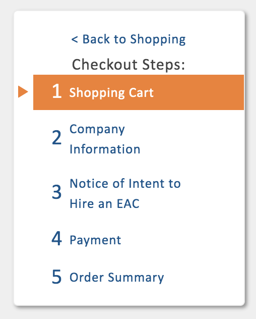
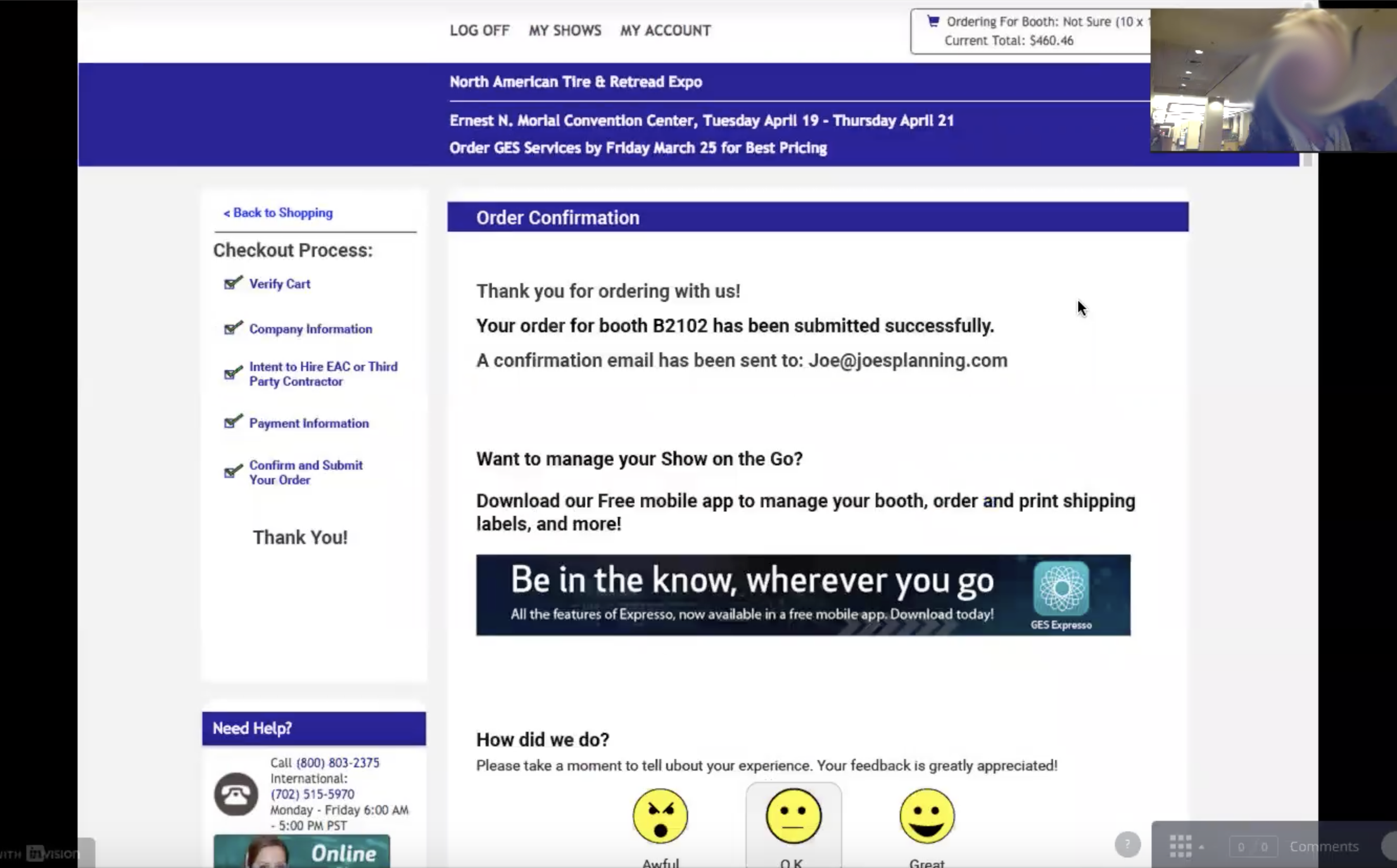
To remedy this, I included a progress indicator which clearly showed where the user was, and what steps were coming up. I also included a clear 'Thank You' page to tell the user what else to expect.
Checkout Progress Indicator
User testing 'Thank You' page on an early prototype.
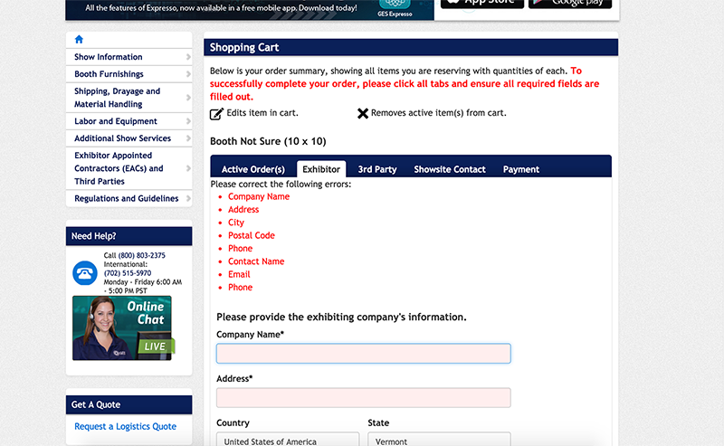
Another issue that caused problems for users in the previous checkout was the tabbed design. Users did not see the required fields hidden behind tabs, and their attention went to the continue button at the bottom of the page rather than back to the top after filling out the visible fields. This caused the user to see repeated validation errors and in some cases to lose information that they had entered.
The NOI page which confused users
Required information behind tabs caused validation errors and confused the user
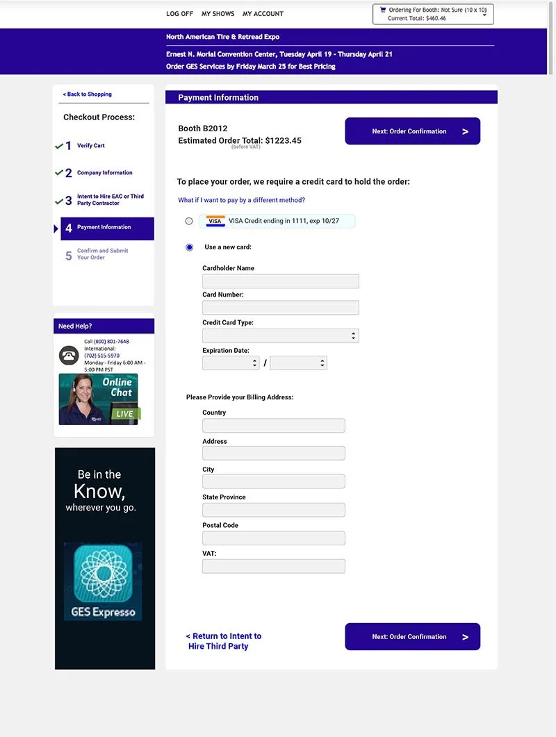
The new design would do away with the tabs and leverage the user's instinct to click the continue button in order to walk them through the process. Validation would be proactive wherever possible to minimize data entry errors, and information entered would be stored at every step and saved for reuse on a later purchase.
Payment Step Before
Payment Step After
Prototype Testing
I created the designs and took them through a few quick iterations with stakeholders to make sure they met business needs and other designers to get critiques. At this point, I wanted to find a way to put them in front of actual users before we spent months developing them. Since I wanted to be able to test a few major elements of the interaction design and be able to get deeper insights from users at the same time, I decided that moderated testing would be ideal.
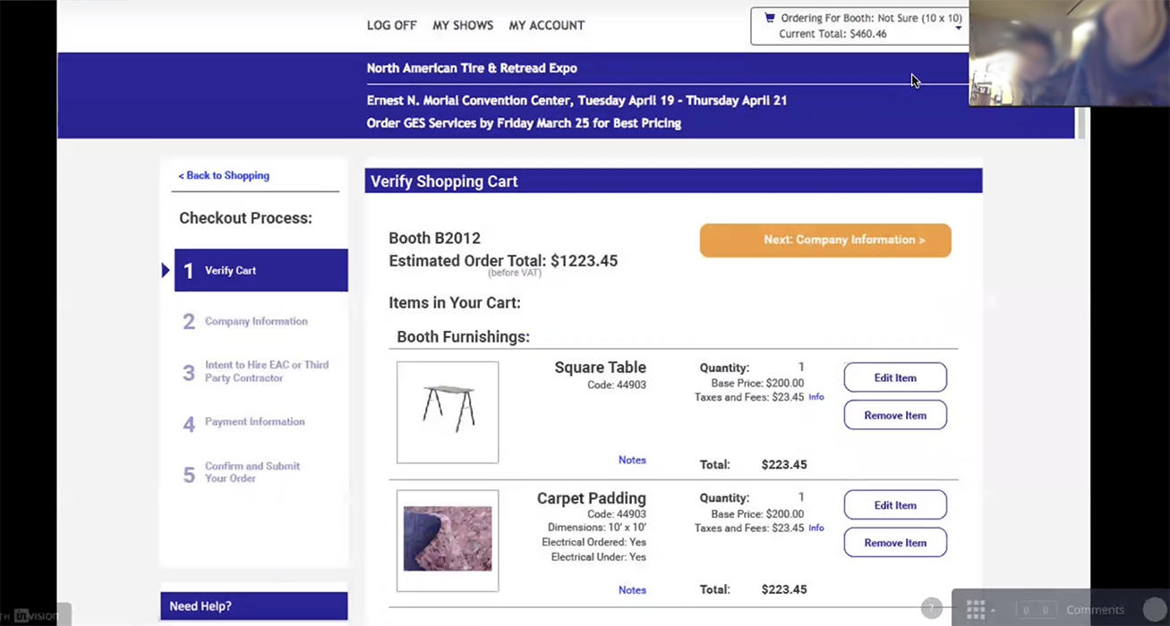
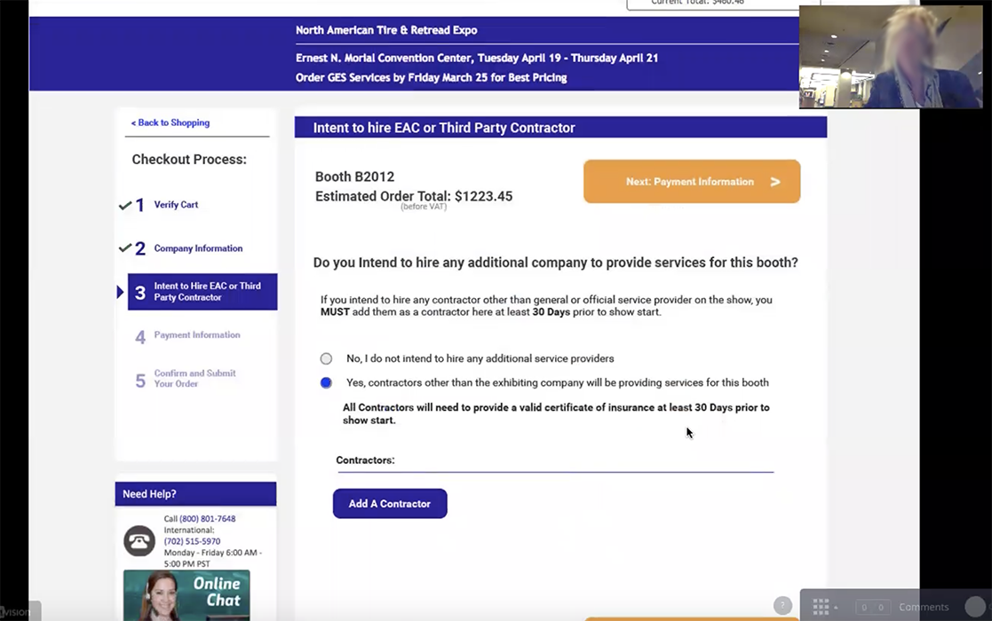
I used invision to link together the screens I had created in order to get the general feel of a stepped process. User testing would need to be remote to best reach our actual users and keep down costs, so I decided to use Zoom, our video conferencing system, which allowed me to show the prototype, give the user control of the mouse, and record the session. Once I had walked through the setup with a colleague, I created a script and began recruiting from existing users of our site through email.
Early prototypes were user tested in person in down hours after exhibitors had set up and recorded on zoom
User Testing early prototypes using InVision
The user testing sessions confirmed some things that I had previously suspected, as well as highlighting some things we had missed in the business review. Users were comfortable with the overall navigation scheme, and were able to form expectations of how to complete tasks based on the interface presented to them. A few business requirements that were unique to the industry and the company were unexpected and caused confusion, so we redesigned those to show only the specific info needed at the time and minimize cognitive load.
After the changes from user teting had been incorporated, it was time to begin the development. I worked in sprints with the dev team, and created most of the HTML and CSS that would be used for the final product. I also attended standups and met with developers as needed to clarify certain features. Throughout various points in development, I continued to conduct user tests in our UAT environment to find problematic behaviors in fields and validation behaviors that we could fix as we went.
User testing a coded prototype in a testing environment
User testing a coded prototype in a testing environment
Rollout and Post Release
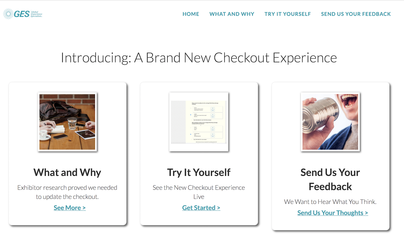
Since this change would need to be supported by our call center staff, it would be necessary to familiarize them with what was coming before releasing it. To that end, we conducted trainings with them about the new feature, and I created a reference site that detailed what changes we had made and how to help users through it.
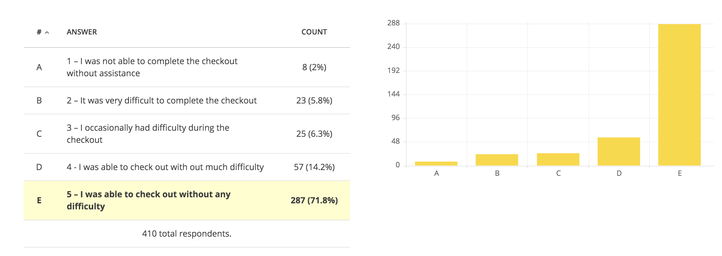
When the product was finally rolled out, it was a resounding success. Checkout completion rate jumped nearly 10% over the old design, and customer satisfaction scores showed 9% fewer people reporting an experience they rated below 4 out of 5.
Survey results post release
Checkout intro site for internal users
Retrospective
This project was an important piece of a group of improvements which contributed to a 48% annual increase in revenue through the product, decreased the rate at which customers needed to contact our call center, Increased overall percentage of market share captured by roughly 4%, and allowed us to expand the tool and gain adoption internationally. As one of our first undertakings with me on the team, it also served as an important psychological vistory both for the team and the business at large, showing that we could undertake major, impactful projects.

