CRM Add Flows
Design Standardization to multiply efficiency
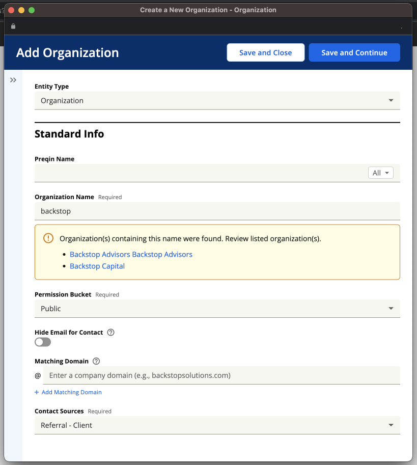
Screenshot of the template in production showcasing live de-duplication
Screenshot showcasing live record addition mid flow
Summary
In this project, I stepped into an expanded role which required me to conceptualize the project, oversee design work from an offshore team, and create a strategy for rollout, continuous discovery, and validation. I functioned as the owner of the OKRs for the project, which rolled up to department wide initiatives. This project saw an increase in client satisfaction with the task of 20%, and laid the foundation to scale other important functions.
Organizations Entered per Client
43%
Regular Users per Organization
27%
Previous Layout
Defining the Problem
Manual data entry capabilities were at the core of the CRM value proposition, enabling the downstream flow of information into reports, data visualization, and due diligence processes which led to investment decisions and ongoing regulatory compliance and relationship management. It was also tedious, prone to human error, and wildly different within the web tool and across entry points (Mobile and Outlook).
The creation of various kinds of records within the system had been designed over a period of years as those types of records were added, and done in a way that did not consider the journeys and needs of different users. The difficulty of mastering the tool meant that creating a record often fell to particular users, often administrative assistants or operations specialists, who may have to piece together a record from secondhand information. Many times, clients had to consider at what point it was “worth it” to enter a contact into the system, which meant that downstream reporting activity gave a very limited picture of team activities to management and operations specialists. All of this limited the value that clients were able to get from the tool, and dragged on the amount of seats that could be sold.
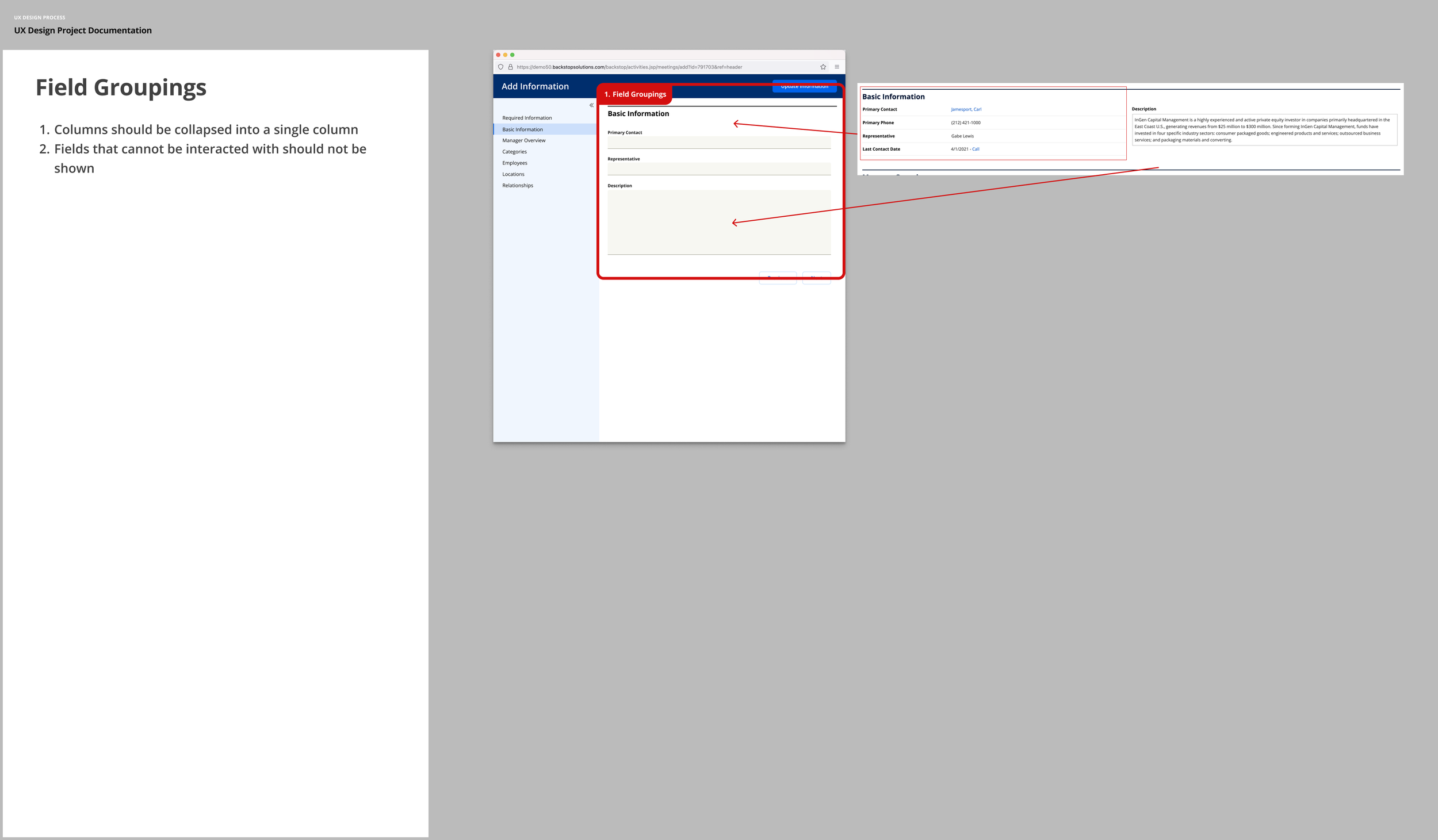
Previous layout with notes
Recommendation for future design
Recommendation for future design
Discovery
Since a previous UX team member had done some research on this project, my first step was to familiarize myself with that research. One major theme that began to take shape was the need for simplifying the UI - users were shown a multitude of fields, many of which they did not have the information to fill out at that time. Required fields were scattered throughout the interface, so the user had to sift through a number of blank fields in order to identify and complete them.
From there, I took the opportunity to identify different internal departments that were impacted and conduct a listening tour, since I was new to the organization. This helped me to understand the different use cases and the problems that were presented to each type of user, and to begin to explore different ways that I could gather information. As part of this, I made a point of sitting in on meetings with the offshore development team in order to understand their workflow and best practices for working with them.
Finally, I conducted an evaluation of the current state of the tool in order to better understand some of the issues with the UI.
Recommendation on Information Layout
Benchmarking
Since it was difficult to discern the direct business impact of this functionality from the available reports and analytics, the UX team needed to find a way to consistently measure the impact of our efforts. We created our “UX score” , a metric that combined ease of use with desirability, perceived business impact, and overall satisfaction by rolling 4 questions rated on a 1 to 5 scale into one score.
We then wanted to identify users who would be good candidates to ask these questions. Using Splunk, I wrote a query that allowed us to identify users by username and get a count of how many times they had created the kind of record we were focused on over a recent time period. This data could be cross referenced with another data set that allowed us to see the user’s name, company, relationship manager and email address. After coordinating with the relationship managers about the users I wanted to contact, I had a curated list of clients I could get feedback from.
In order to get their feedback, I created a survey in Alchemer which asked them the questions from the UX score, as well as a few open ended questions to get more insight. This survey was sent out as a link in an email blast from our system, which allowed us to track open rates. The result was an average UX score of 3.75/5 .
Survey Results used to benchmark the current process
Early wireframe concepts
Wireframes used to explore key concepts
Early Designs and Feedback
With the information I had gathered so far, I was able to begin creating initial designs that I could use to get client feedback. I focused on building these around existing patterns within our design system where possible in order to maintain a consistent visual style and speed development.
One recurring pain point was that it was difficult for users to find and fill out the fields that they needed or wanted to due to the sheer number of fields on the page. There was a broad spectrum of use cases, from those who wanted to get the bare minimum into the system in order to get the record created so that they didn’t lose track of a contact they had just spoken with to users whose jobs entailed creating detailed files on potential investors or investments. To solve for this, we broke up the presentation of the information so that required fields were separated from the rest of the fields and shown first. Users could choose to enter the bare minimum and save the record, or they could choose to continue on and enter more detailed information if they so desired.
The detailed information that they entered would often come from other browser tabs, so we designed the form to open in a new window. This cut down on the need to switch back and forth between tabs while copying and pasting information, and followed a previous pattern established within the software.
Feedback from early user tests led to a concept that opened as a new window
Initial design recommendation for deduplication
Early deduplication concept
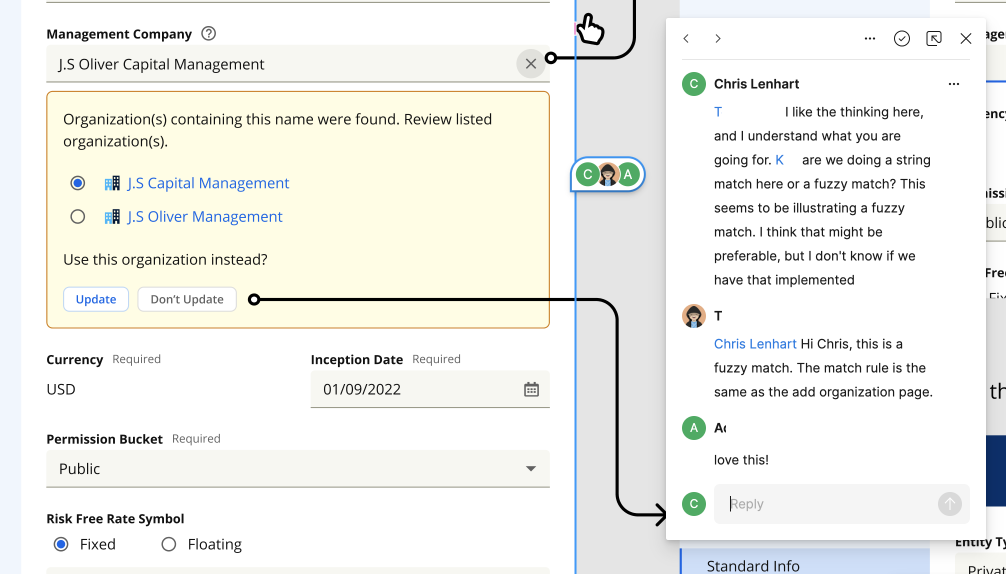
Another pain point was the duplication of records. Since it was hard to know if someone within the client’s organization had already created the same record in the past, clients often spent time searching through the system to make sure they didn’t create duplicates, and had time consuming semi-regular processes of auditing and eliminating duplicate records. In order to address this, we introduced a feature within the interface that would run a string match on the information entered in certain fields and return any matches already in the system. If no matching record was found, they would be notified of that fact and could move on with increased confidence.
By showing only required fields first, the process was simplified
Fields were presented using existing grouping in the system backend
We also chose to streamline the workflow in order to allow the user to create other kinds of records within the workflow. Previously, if the user was creating an organization, they likely could not assign a primary contact unless the person they assigned was already in the system, which was unlikely for an organization that was brand new to them. We gave them the ability to quickly create some other kinds of records without leaving the workflow to save them from needing to navigate back and forth between multiple records and needing to remember to go back and assign values to fields.
Now that we had these concepts, we needed to get feedback from clients to make sure the ideas we had rang true to them. To do so, we conducted sessions with clients to run a storyframing exercise. We would describe a scenario to them that reflected a situation that was similar to one they might encounter and walk through a rough prototype with them that highlighted the functionality we were thinking about before we put time into building it. The conversations were purposely designed with space to hear their feedback at certain points and ask follow up questions.
At the end of each session, we would ask them to rate the design they saw based on the UX questions we had used as a benchmark. The score improved slightly to 3.9/5, but we clearly had more work to do. We set about incorporating their feedback into our ongoing work.
Early MVP and Iterations
While we were incorporating user feedback into the design in order to refine it, we set about starting the process of getting our dev team working on something more real. I began to meet regularly with our team based in Changsha, China, in order to begin the process of turning the concepts we had into finalized designs and code.
We worked with the Product Owner from that team in order to create JIRA tickets for functionality and answer broad questions that our devs may have. We also collaborated asynchronously with the production designer on that team to review work done to fine tune details and flesh out ideas.
Collaborating with our offshore team using Figma
Adding confirmation messages
Illustrating field relationships
Illustrating behaviors of table based components
User testing the MVP
Once our dev team had produced something that showcased the basic functionality, we wanted to get more feedback from clients. Figma prototypes are nice and can be very powerful, but feedback on real code was important for some of the concepts we were trying out.
We went back to our pool of clients and set up user testing sessions using a similar scenario to the one we had used before. This time, we asked our users to enter the information we provided using the new interface and speak aloud as they did so. In some cases, we purposely set the environment up to contain duplicate records so that we could test the duplication warnings.
At the end of the sessions, we asked the same set of UX benchmark questions as we had before, and from these we were able to see that scores had improved dramatically. If clients were a good fit, we asked them if they would want to participate in a limited Beta program.
Through user testing, we found it was ideal to have the side panel collapsed initially.
Deduplication was specifically triggered in user testing
Deduplication allowed participants to have confidence in the records they were creating
Beta Program
It’s one thing to say nice things about a software tool that you’ve used once when the people who built it are right in front of you, it is another thing to have positive feedback after using the tool regularly. For this phase, we identified a handful of clients who were willing to use this tool in place of the previous one for a month, at which time we followed back up with them and asked them to rate their experience based on our UX benchmark questions. Results were very positive, with scores improving to 4.5/5.
Feedback from the beta program was presented to the wider company.
Managed Rollout
Once we were confident that our solution added significant value for our clients, it was time to begin rolling it out. Since any large change had the potential to trigger calls to our client service department, we decided to roll the feature out gradually so that we could monitor any impact on other departments.
I met with our client care department to give them a heads up on what we were planning, and asked what I could do to support them. They asked for a confluence page to help their reps understand the upcoming changes and answer any questions, and so I built a page out and shared it with them.
I also contacted the relationship managers of clients in the first wave to let them know which clients would be getting the new functionality, and to see if they had any objections. They opted to remove a few names from the list because of ongoing contract negotiations.
Once coordination was in place across departments, we wanted to let the first wave of 50 clients know to expect a change. We sent out an email to these clients about a week ahead of the change letting them know what to expect. We also included a note in our release notes about the feature, which prompted one client to ask to have the feature turned on.
When the day came, I went in to our back end system and enabled the feature for the chosen group of clients. After they had been using the feature for just over a month, I followed up with a survey containing our UX questions. Too few results were returned to be statistically significant, but responses trended similarly to those of our previous efforts.
Splunk dashboard monitoring key metrics during rollout
Retrospective
This project was a significant step towards setting an initial pattern that could both be scaled and in the future allow certain aspects of the product to be more flexible and responsive to client’s individual needs. The improvements in the ease of use and duplicate detection mean that clients will be able to bring more users on to the system, which means more seats sold for our business.
It also introduced new responsibilities and new ways of working for me. While I did create the initial designs, architecture, and conduct all of the user facing interviews and usability tests, many of the subsequent production designs were handled by our Changsha team. My role was much less to produce pixel perfect, production ready designs, and more to oversee and direct ongoing work and to manage the strategy around user research and rollout.


